notification-badge
@parthamk/notification-badge
A simple, modern, and animated notification badge React component.
This is a completely modernized fork of react-notification-badge, explicitly rewritten to support React 18+, Vite tooling, and modern React Functional Components.
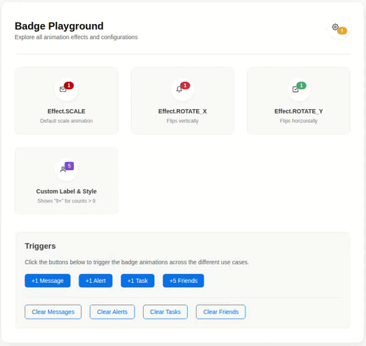
Demo
🚀 What’s New in this Fork? (Modernization)
The original repository relied on deprecated patterns and very old build systems. This version brings it fully into the modern React ecosystem:
- React 18+ Ready: Migrated entirely from Class Components to Functional Components using Hooks (
useEffect,useRef). - No Deprecation Warnings: Completely removed legacy
ReactDOM.findDOMNodeandString Refs, ensuring full compatibility with React Strict Mode. - Modern Build System: Replaced outdated tools (Browserify, Karma, Babelify) with Vite 5. The library now natively exports both ES Modules (ESM) and CommonJS (CJS) bundles for seamless consumption in Vite, Next.js, Create React App, and Webpack.
- Modern Testing: Test suite overhauled to use Vitest and React Testing Library.
- Zero Vulnerabilities: Dropped all ancient dependencies to ensure a clean, secure dependency tree.
📦 Installation
Install the package from npm:
npm install @parthamk/notification-badge
# or
yarn add @parthamk/notification-badge
Note: react and react-dom (v18.0.0+) are required peer dependencies.
🛠 Usage Example
Here is a practical example of how to use the badge in a modern React application.
import React, { useState } from 'react';
import NotificationBadge, { Effect } from '@parthamk/notification-badge';

const App = () => {
  const [messages, setMessages] = useState(0);

  const containerStyle = {
    position: 'relative',
    display: 'inline-block',
    padding: '10px 20px',
    backgroundColor: '#333',
    color: '#fff',
    borderRadius: '8px',
    cursor: 'pointer',
    fontFamily: 'sans-serif'
  };

  return (
    <div style=>
      <div style={containerStyle} onClick={() => setMessages(messages + 1)}>
        Inbox
        <NotificationBadge
          count={messages}
          effect={Effect.SCALE}
          style=
        />
      </div>

      <div style=>
        <button onClick={() => setMessages(0)}>Clear Messages</button>
      </div>
    </div>
  );
};

export default App;
⚙️ API Reference
<NotificationBadge /> Props
| Prop | Type | Default | Description |
|---|---|---|---|
count |
number |
0 |
Badge count. If count < 1, the badge will not be rendered. |
label |
string |
null |
A string label to render instead of the numerical count. |
containerStyle |
object |
{} |
Custom inline styles applied to the outer container. |
style |
object |
{} |
Custom inline styles applied directly to the inner badge element. |
className |
string |
undefined |
CSS class name applied to the badge element. |
effect |
array |
Effect.SCALE |
The animation effect array to apply upon count updates. |
frameLength |
number |
30.0 |
Frame length for the animation (default is 30 frames, i.e., ~0.5s at 60fps). |
Effects Array Structure
The effect prop accepts an array in the format [string, string, object, object]:
effect[0]: Applied totransformon the first frame.effect[1]: Applied totransformonframeLength.effect[2]: Applied as inline styles on the first frame.effect[3]: Applied as inline styles onframeLength.
Pre-defined Effects
Import the Effect object for ready-to-use animations:
import { Effect } from '@parthamk/notification-badge';

// Available effects:
Effect.ROTATE_X
Effect.ROTATE_Y
Effect.SCALE
💻 Local Development
If you wish to contribute or run the example locally:
- Clone the repository.
- Install dependencies:
npm install - Start the local Vite development server for the interactive example:
npm run dev:example - Run tests using Vitest:
npm run test - Build the library:
npm run build
📜 License
MIT